A website is the most important digital asset for a B2B brand because this is where your prospects and customers land to learn more about the product and services. And usually, it is your website where you build trust and credibility with your potential customers.
They want to know how your company can help their business grow and what problem you are solving. And it is your website’s job to provide all the answers in the best possible way to help your customers make a well-informed decision for their business.
When it comes to designing a B2B website, there are a lot of factors that come into play to make it highly convertible and provide a great user experience to visitors.
That’s why brands frequently design, redesign, optimize, and test their B2B websites – Website design is a never-ending iteration process for the design and marketing team of B2B companies.
If you are also thinking of designing a new website for your business or redesigning the old ones for better conversion, this is the best place for you to find inspiration.
In this article, I will show you my favorite and the best B2B website examples that you can use as inspiration for your website.
Ready for some inspirational boost? Let’s get into it.
1. Asana

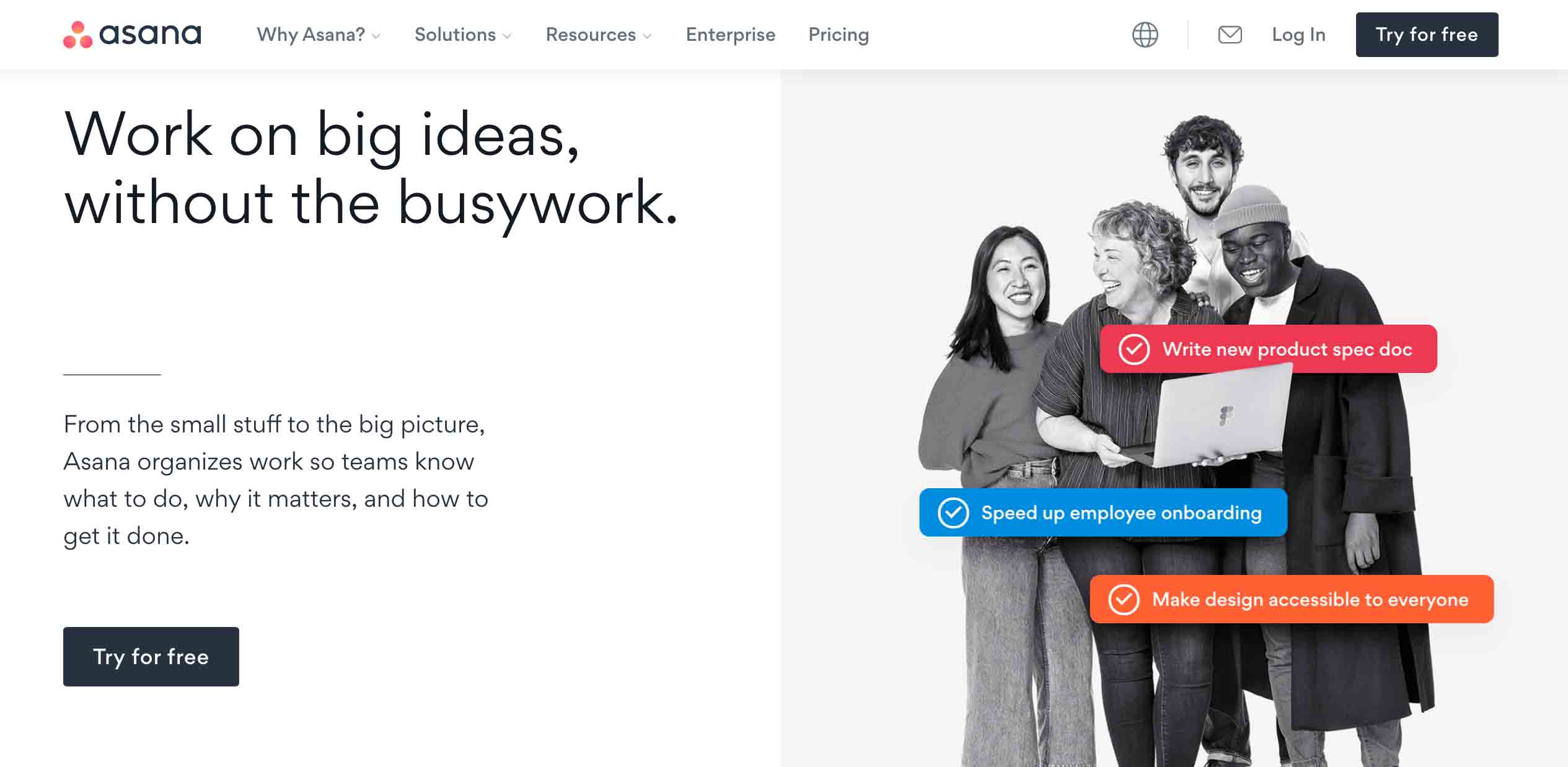
Asana’s homepage features a streamlined flow of communication with a clear call-to-action. I say it to be ‘streamlined’ because the main role of a project management tool is to establish a shared workspace, and this aspect is the focal point in their entire website design.
When you scroll down, you can see that a motion effect has been applied to explain its feature sets. As Asana entirely relies on shifting and movement of tasks and priorities, the design has to be dynamic and does complete justice to it – Images might appear static and will not truly reflect the brand’s potential identity.
2. HubSpot

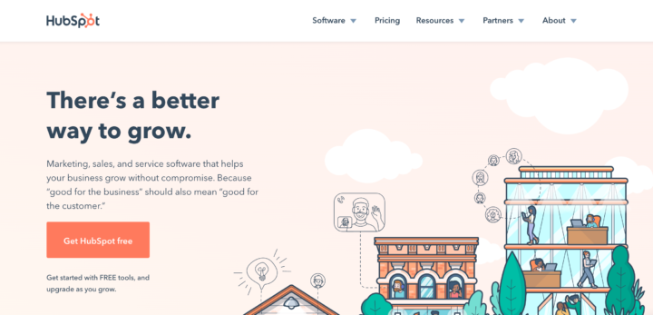
HubSpot is the pioneer in B2B space and provides numerous sales, marketing, and customer service solutions to boost your business. Having so many features to explain, HubSpot uses a non-clutter design approach for its website.
The homepage gives a glimpse of features and adds a CTA that directs you to the corresponding subpage, where all details are presented elaborately. Even the subpages deliver you an effortless way of engagement as the information is presented in a clear-cut manner.
The flow of information is direct, which enables users to engage on the site easily. HubSpot is an excellent B2B website example because it gives you the confidence to present a large amount of information in a coherent yet straightforward way possible.
3. Zendesk

While designing your B2B website, you must creatively explain how you can add value to your target audience. To illustrate this, Zendesk would be the perfect B2B website design example as they deliver their USP by writing a compelling website copy.
The homepage is accented with a laser-focused description followed by two powerful call-to-actions, which intrigues users to give a try for sure. They have also embedded a video button that keeps you highly engaged and sliders to provide an interactive experience.
They highlighted their brand by adding a sense of humanized touch in every design aspect, as creating a conversational experience is the company’s unique value proposition.
4. Salesforce

Salesforce is one of the leading enterprise CRM software, and its website design incorporates both humanized and creative design touches. They use the famous cartoon-like character called the trailhead and pictures of real humans, which depict their company culture.
The homepage is filled with enormous information since the company offers numerous solutions to its customers. Though the website is filled with plenty of elements, the design and appearance are still engaging, informative, and targeted towards the right audience.
5. Grammarly

Grammarly is one of the must-have tools for content marketers, bloggers, and even sales professionals to write compelling emails and avoid grammatical mistakes. It provides writing assistance and corrects all the misspelled words that make your content legit. Grammarly’s website design outshines its functional minimalism approach.
With a simple website copy with no more than two to three lines and eye-catching images, it has perfectly pitched all the key points and features. It has wisely placed its call-to-action in the appropriate places to make users perform the desired action.
This is another excellent B2B website design example that takes the approach of simplicity and elegance because the content gets quickly registered in the target audience’s minds.
6. Dropbox

Dropbox is a flexible file-sharing platform that hosts everything on the cloud. The entire website copy is presented directly and straightforwardly, which gives users a clear understanding of the product.
It has created different subpages that show how individuals and organizations can completely utilize Dropbox. Blue, being their brand color, highlights the different call-to-actions to gain the visitor’s attention.
7. Zoominfo

Zoominfo offers data-driven solutions that allow you to access its database, and you can potentially connect with more leads to grow your business. They deliver their key value proposition in every aspect of their website design.
It uses a sticky bar that explains all its services without the need to navigate to another subpage. The images change automatically according to the features that show a high amount of liveliness and dynamism.
Since they connect you to prospects and build relationships, you’ll get the same feeling for yourself as to its potential consumer. This depicts how potentially competitive they are and nurtures a strong sense of personal connection with their target audience.
8. Trello

When you want to take a classic design approach that potentially gives an organized structure, the most relevant B2B website design example will be Trello.
Trello has taken a detailed text-based approach to explaining all their key features. They have added a “learn more” button below each description, which shows more information in bullet points instead of taking you to another page. This adds an advantage for users to know more about the specific feature without loading another page.
Though Trello has a dominating amount of text than images, it provides a good user experience, and everything is presented in a non-clunky manner.
9. Hootsuite

If you wish to grab the complete focus of users within a microsecond once they land on your site, then you should not miss out on checking out Hootsuite’s stunning web design.
Hootsuite has perfectly structured its website keeping its target audiences in mind. Marketers use this tool for social media management and the first thing they would ideally focus on is the pricing. So this acts as a creative edge in the overall site design.
10. Evernote

Incorporating minimalism in B2B website design is still overlooked, but it has great potential to deliver high engagement. Evernote is the perfect example of this as it provides a sleek and lucid design approach that makes it easy for you to scroll till the end.
The placement of call-to-actions is worth appreciated as it is placed in a position that grabs more attention. It maintains its simplicity by precisely explaining the features crisply and visually explaining how they appear in mobile and desktop versions.
Also, they have highlighted their pricing plans in three vertical bars with a relevant call-to-action. This will psychologically trigger you to explore their product, and there are high chance that you might become their customer.
11. Slack

Slack is a visual feast that uses exceptional branding skills to showcase its brand power. All the call-to-actions are placed in the perfect manner that makes users quickly download the application.
It offers a dynamic web design wherein you can automatically play with their images as you scroll down and the colors in the background change. Their homepage acts as a magnet in pulling your eyes as it offers a compelling look and feel.
Slack’s main goal is to improve workplace productivity and has achieved this by adding human touch to every aspect of its design. This, in turn, delivers an excellent user experience which is a crucial factor for driving more conversions.
12. Batterii

Batterii is a collaborative platform that offers tools to collect, organize, and share all your creative ideas. If you look at their website, they have perfectly utilized all the whitespaces, one of the key factors that reflect your design flow.
The homepage has a simple and minimalistic design that places an element in the center which illustrates the workflow, and it is surrounded by the feature highlights. It has a sticky header with two call-to-actions that enable users to perform the intended action.
Overall, this is a better B2B website design example because it is not always mandatory that your site possess complex design elements to attract people. Information presented concisely is the biggest creativity that you can expose to the world.
Wrapping Up
By now, you must have grasped all the brilliant ways of building a phenomenal B2B website that can skyrocket your sales and conversions.
Remember, your website serves as a representation of your brand and is a virtual home that should make customers stay for a long and provide the information they seek about your products and services.
Before wrapping up this article, here are a few tips for you to design a compelling B2B website –
- Clearly define your website objective
- Focus on highlighting your unique value proposition
- Fix your website KPIs to analyze its performance
- Try different placements of the call-to-action
- Create a smooth flow of information
- Provide flexible navigational flexibility to your visitors
If you were here to get some design inspiration for your website, I hope this article helped. If so, don’t forget to share with your fellow marketers and designers on social platforms.
